
GoCentral Onboarding
GoCentral Onboarding
Increasing the likelihood that new users become successful when adopting GoCentral
̌
PROBLEM
How do we guide users through the site set up process and get them to publish faster?
Overview
GoCentral was created for the sole purpose of empowering anyone to be able to create a website in under an hour from any device. GoDaddy’s previous DIY site builder, WebsiteBuilder, was in it’s 7th version and had become a rather clunky drag-and-drop editor that was in dire need of an aesthetic and usability overhaul in order to compete with Wix, Weebly and Squarespace. The replacement for WebsiteBuilder and OnlineStore, dubbed vNext and later branded GoCentral, was developed to unify the two product offerings, conquer website creation on mobile devices, and include a suite of tools to make small business owners successful online. My job as the sole designer was to get users into the product as effortlessly as possible.
GOAL
Get users to publish their site at the same rate as WebsiteBuilder v7 or better
PROCESS
I generated a competitive analysis of how Wix, Wix AI, Weebly and Squarespace onboarded users before checking out really great non-competitor experiences (shoutout to Canva!).
I mapped out the journey that depicted the stages, actions, emotions, and touch points that current users encounter during onboarding to highlight areas of friction and create an organization-wide vision.
Analysis of the current WebsiteBuilder's quantitative data on flow drop off and publish rate in the onboarding process along with unmoderated in-person user interviews identified areas of friction, delight, and opportunities for improvement.
THE BIGGEST PAIN POINTS WERE:
- Not allowing the user to try the product before they buy
- Forcing the user through a long account creation and payment flow
- Providing too many templates and not having a way to switch that template afterwards without losing all their content

Exploring different user flows for MVP onboarding
I worked with the PM and Engineering lead to identify business needs and technical considerations and whiteboarded out possible user flows.

Early sketch looking into category picker in onboarding
Multiple wireframe variations were tested to get feedback on the following questions:
- Do users want the ability to choose a design during onboarding? If so, how many design options are enough to feel satisfied?
- Do users want the ability to add their colors or a logo during onboarding?
- Are users able to easily answer the question “what’s your site about?”
- Will providing a location be a deterrent?

Wireframes showing three simple questions in onboarding: 1) what's your site about? 2) what's your site name? and 3) where are you located?

After selecting a category in InstantPage, high quality stock images related to that vertical would appear in the background.

Bringing the drop off down to 7%
User testing to determine best layout for design gallery
USER TESTING PROVED THE FOLLOWING:
- Users did want the option to choose a design during onboarding and were satisfied and felt they had enough options when shown 25-30 designs.
- When shown more than 30 designs, users wanted to see all the options and took significantly longer to choose one and complete onboarding.
- Answering the question “what’s your site about?” was confusing to some users as they didn’t understand they were essentially picking a category and would enter their site or business name.
- The benefit of adding their location wasn’t clear to users and many were reluctant to as they didn’t have a storefront or address they wanted to make public.

Color Exploration
User testing to determine how and if users wanted to apply a color during onboarding
One variation tested to see 1) if users noticed the color bar at the bottom and 2) wanted to change the color of the designs at this point

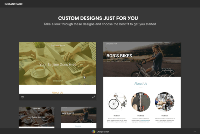
Solution
A no credit card required free trial removed the previous barriers of a long account creation process. Users were quickly onboarded by answering two simple questions that would provide 30 unique, dynamically created designs with stock photos and color recommendations related to their category.

Step 1: Tell us your site name

Step 2: Tell us what your site is about and we'll give you free stock photos related to your industry

Step 3: Choose a design

Step 4: View fullscreen preview and start with this design
TAKEAWAYS
- How you speak to your users is pertinent to get them to provide accurate details. Reordering and rephrasing the “what’s your site about?” question made it more clear to users and reduced dropoff in onboarding.
- Users feel dissatisfied when given less than 6 and overwhelmed with more than 30 design choices for site designs. Breaking the pattern of having users select a theme during onboarding didn’t test well and no matter if the designs are dynamically created or curated by a designer, users still regard them as templates.
This onboarding is live on GoDaddy's GoCentral and has successfully onboarded over 400,000 customers with a post-publish NPS of +53!


