
GoCentral Navigation
GoCentral Navigation
Getting users where they want to go quickly across multiple products
̌
Problem
How do we unify multiple separate apps and create a cohesive information architecture by sharing one navigation system?
Overview
Information architecture is all around you. Take the photo above, which depicts a market with items nicely categorized by type along with signs to inform what they are and how much they cost. Without these signs and categorizations you might be at a loss to find just what you're looking for. This was exactly the challenge that I was tasked to solve as the sole designer on this project.
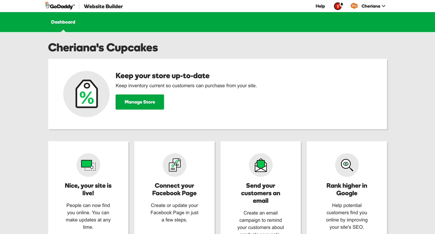
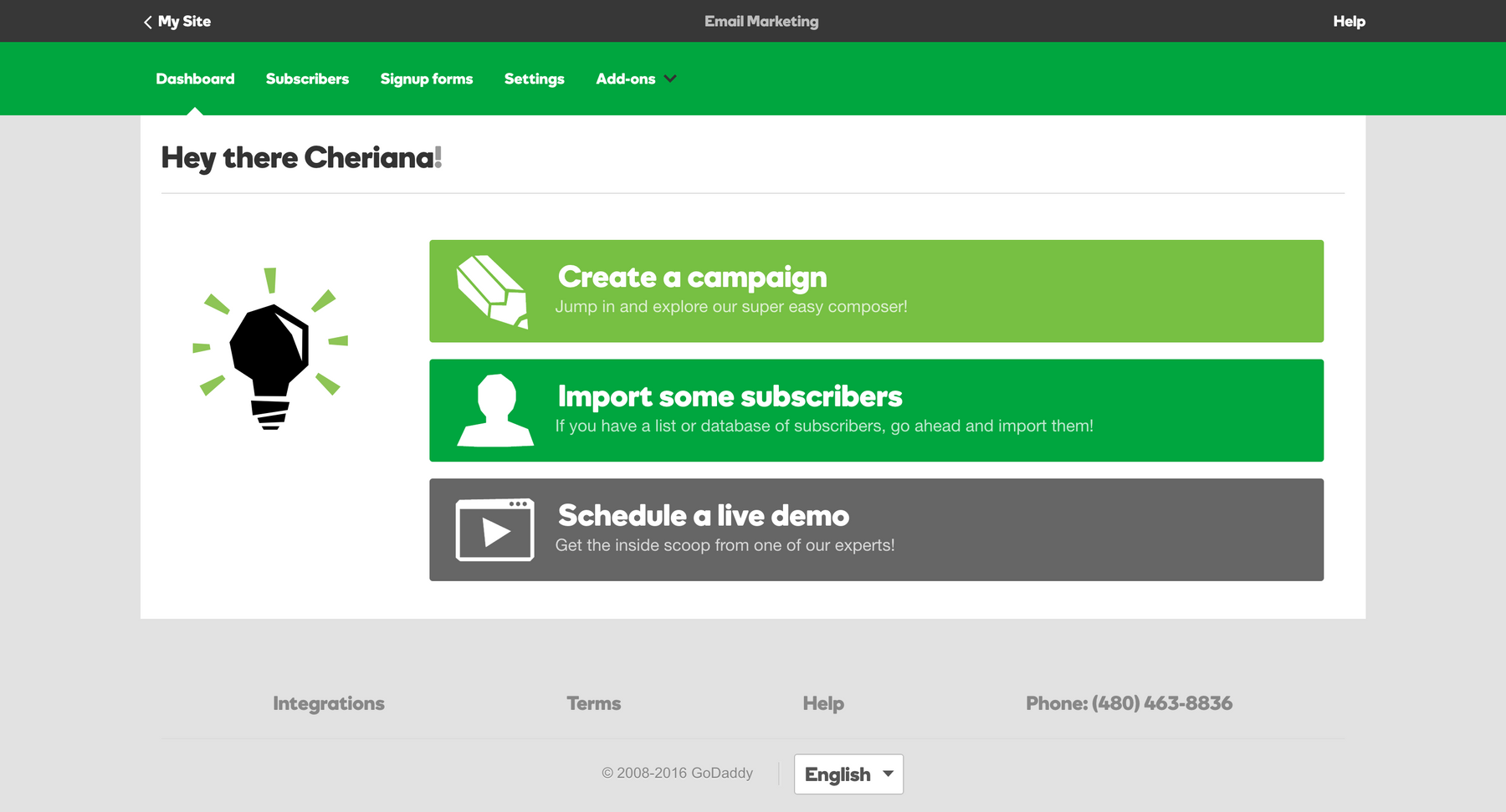
Unifying GoDaddy's WebsiteBuilder, OnlineStore, Search Engine Visibility, and GoDaddy Email Marketing products into the new GoCentral product offering produced the unique challenge of making it appear as if it were one cohesive product when, in reality, users were traversing across multiple products. I had to figure out the best information architecture, while also addressing the existing visual discrepancies for both mobile and desktop navigation. This required joining forces with multiple teams across the company and leading discussions to ensure each product was navigable and our users could find what they were looking for in the least amount of time.
Goal
Develop a navigation structure that shares the same visual design, makes each product more discoverable, and enables the user to accomplish the task at hand.
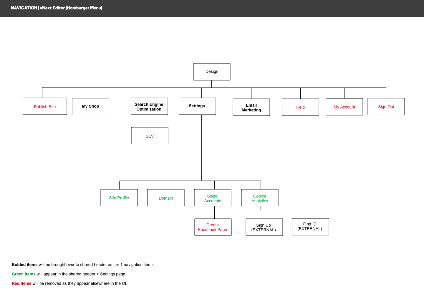
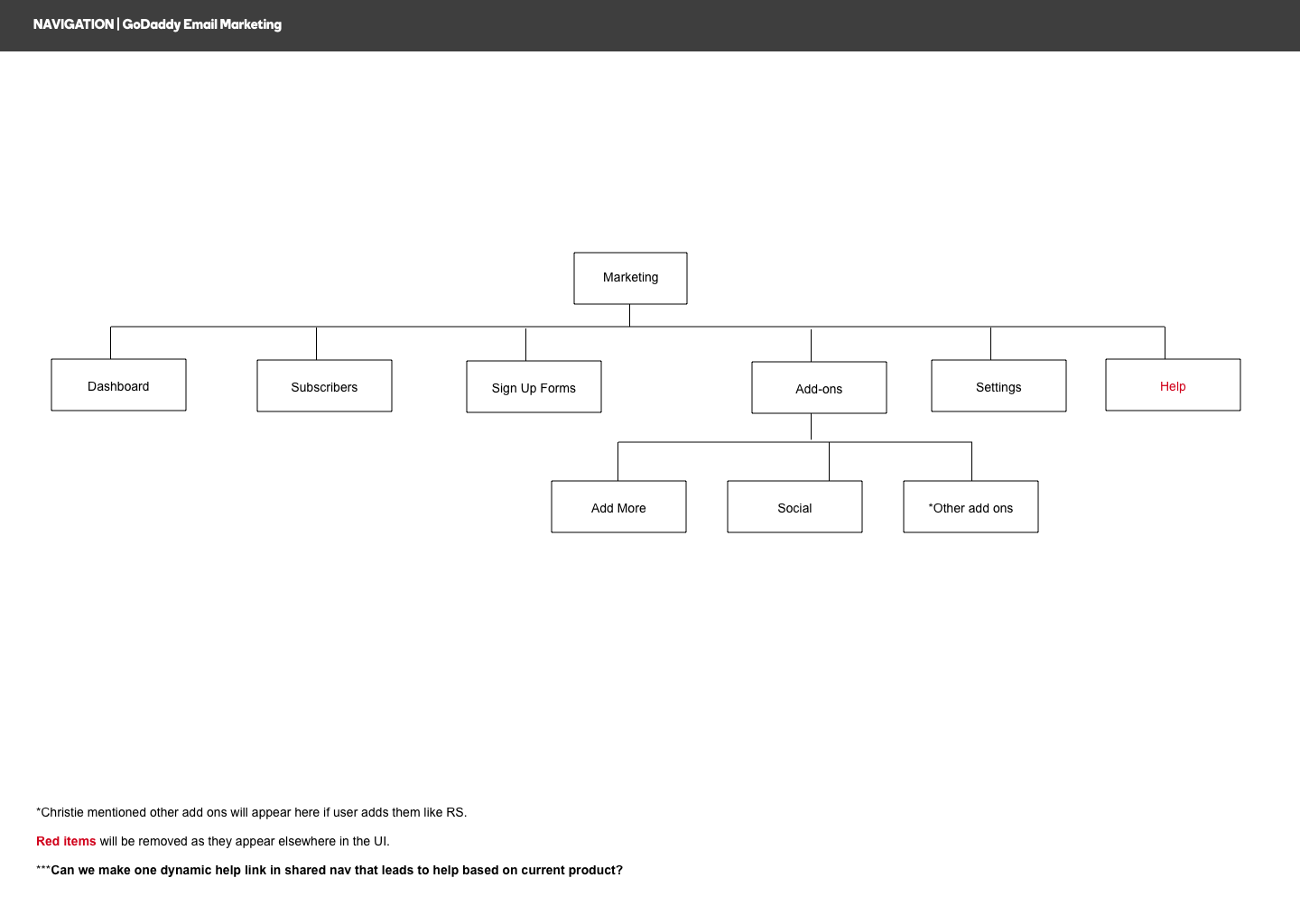
How Each app applied their own navigation styles throughout GoCentral
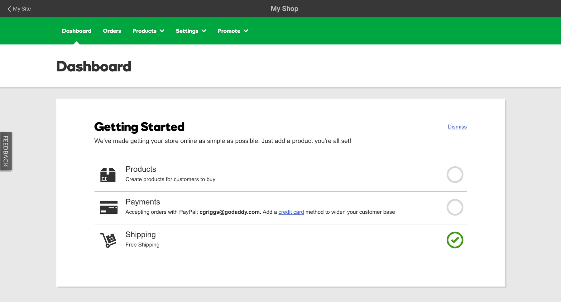
I began by assessing all of the app's current navigation structure and was surprised with what I found. Each app handled navigation differently and most contained a dashboard of its own. My assessment included answering the following questions:
- What are the current links?
- Were all of the links necessary?
- Were there any links that were duplicated elsewhere?
- What links were places versus tasks or actions?
- How could the other apps be accessed?
- What style discrepancies were there, if any?
I worked with 9 (yes, 9) Product Managers to ensure that I didn't miss any hidden pages especially with products like GoDaddy Email Marketing that were also sold separately from GoCentral. We also dug through Google Analytics to find out just how many users were discovering each app and where they were coming from.
Where do users run into problems?
I conducted tree testing on the existing navigation structure to answer this question and found that:
- users experienced much difficulty navigating back and forth from the editor and the online store
- the GoCentral Dashboard was the least discoverable page as it was buried in the hamburger menu within the editor
- multiple settings pages led to confusion on where to edit basic information
How do users think the navigation should be structured?
To gauge the way GoCentral users organized information I created a closed card sorting activity. I provided a card for each of the necessary pages within GoCentral and asked users to organize them under the pre-defined categories: sales, products, marketing, settings, and none.
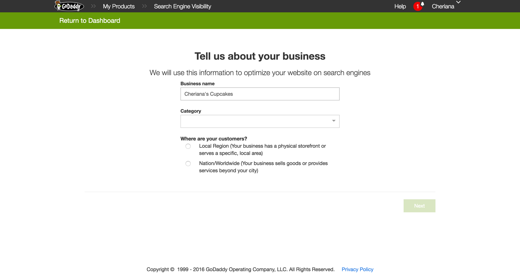
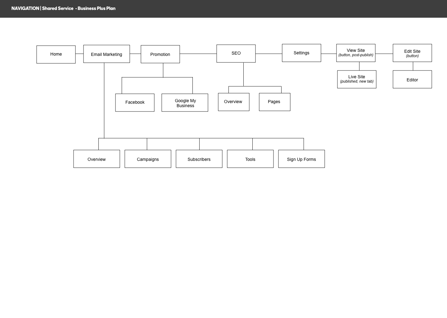
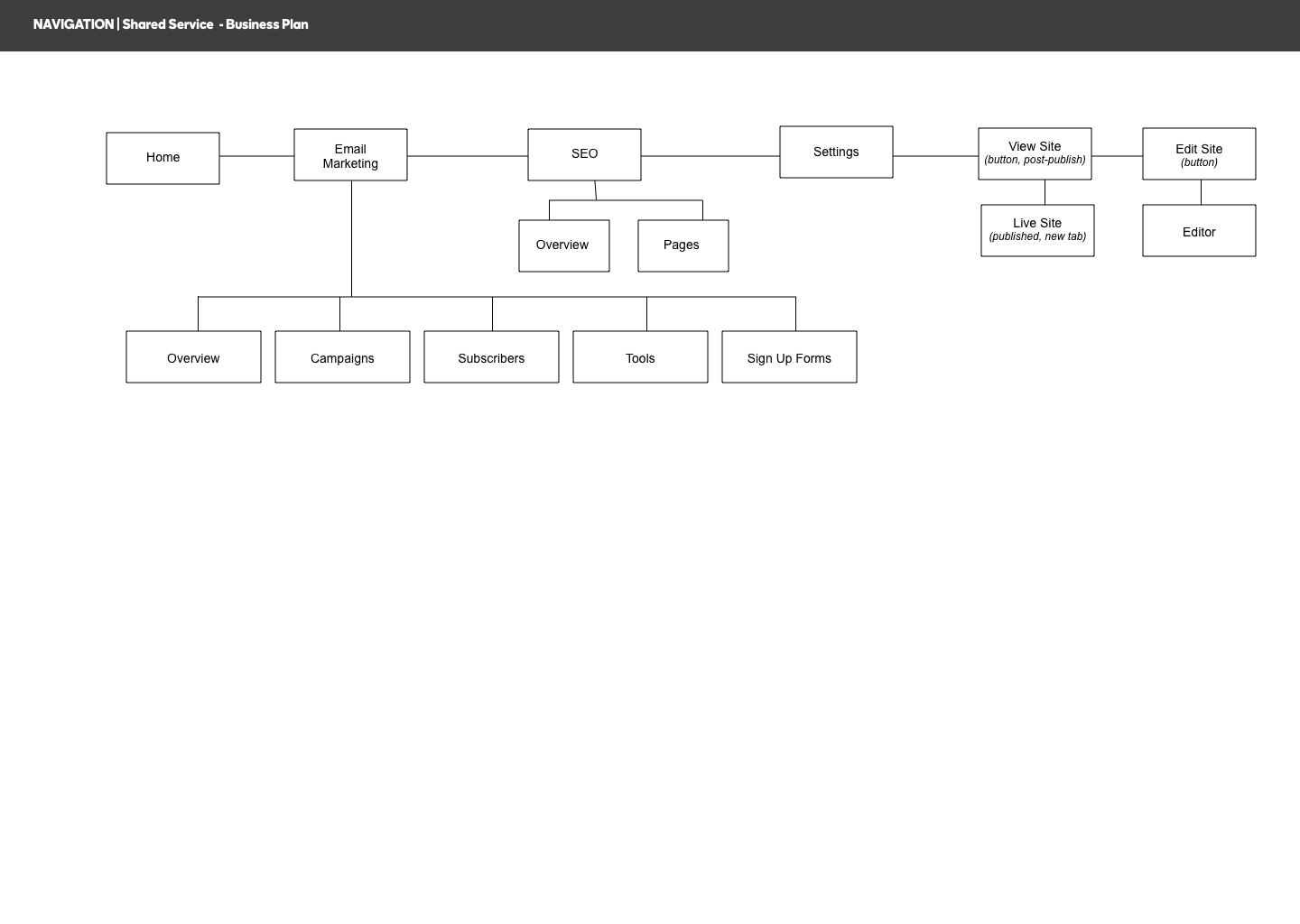
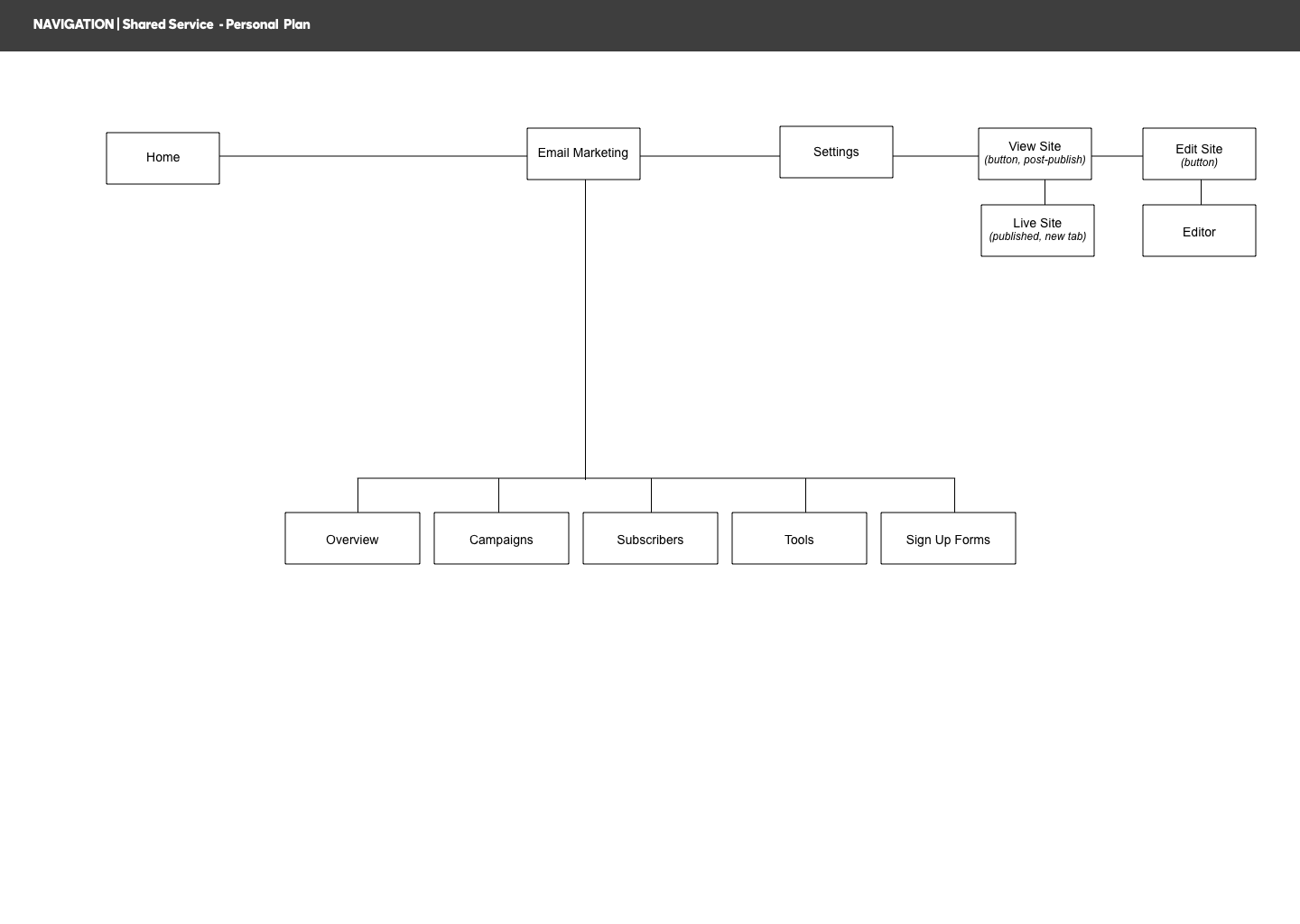
After analyzing all the new quantitative and qualitative data I had, it was finally time to make some suggestions to improve the information architecture. Adding to the complexity of this task was the fact that GoCentral was sold in four plan types (Personal, Business, Business Plus, and Online Store) so I needed to address them all.
A major proposal that I made was to unify all of the settings pages with basic venture data into one place. This would make it easier for a user to modify pertinent details about their site and also remove the need for the hamburger menu in the editor. Unfortunately, this was a huge effort on all product teams to unify the venture data and was de-scoped for the initial release.

Wireframe for new proposed unified settings page
Validating the Information Architecture
My hypothesis was that users would be able to navigate successfully throughout the shared header but would have issues with finding email marketing and Google Analytics.
Results of the first navigation test showed that:
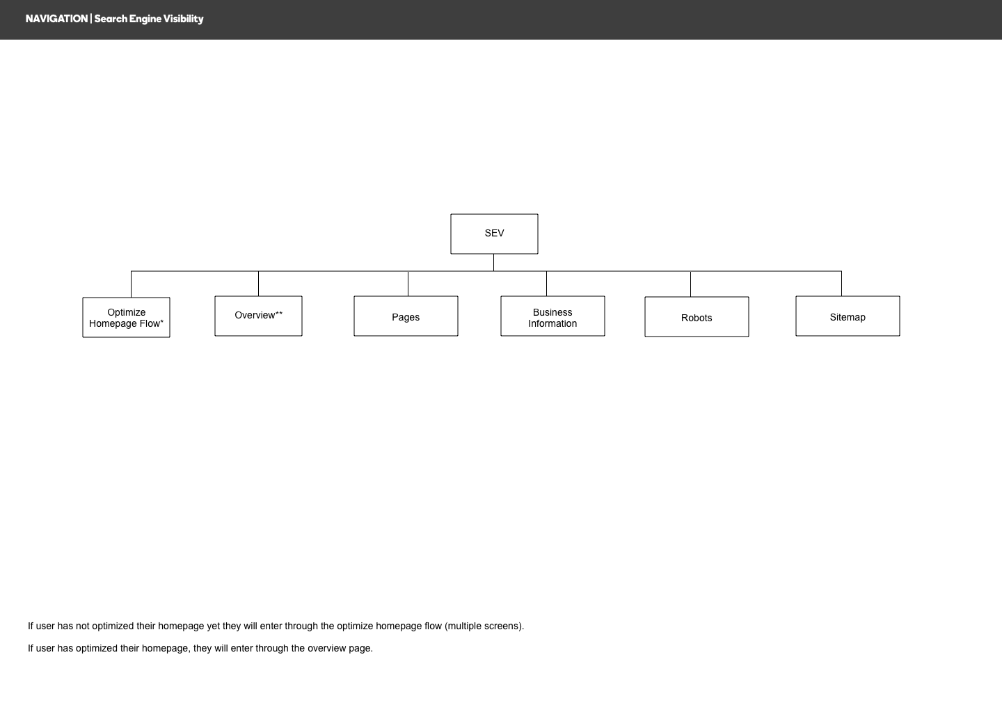
- All users couldn't find Google Analytics
- The majority of users were confused by email subscribers location
- The majority of users were confused by the difference between edit site and manage store
- One user was confused by the email settings location
- One user was confused by the payment settings location
- One user didn't see edit site button

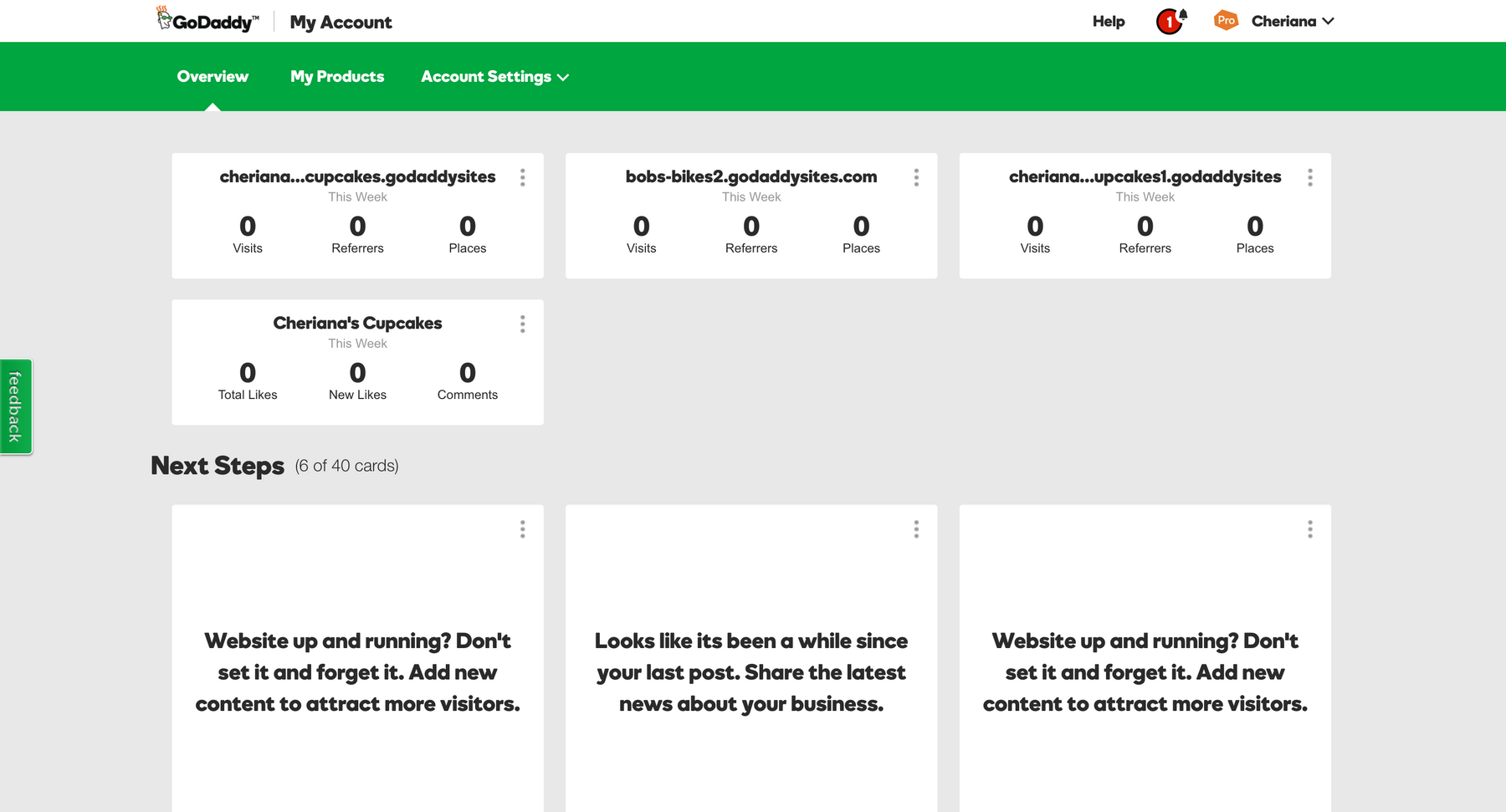
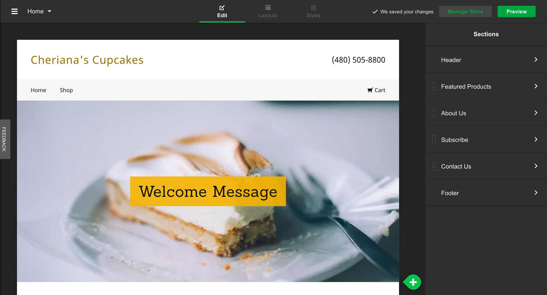
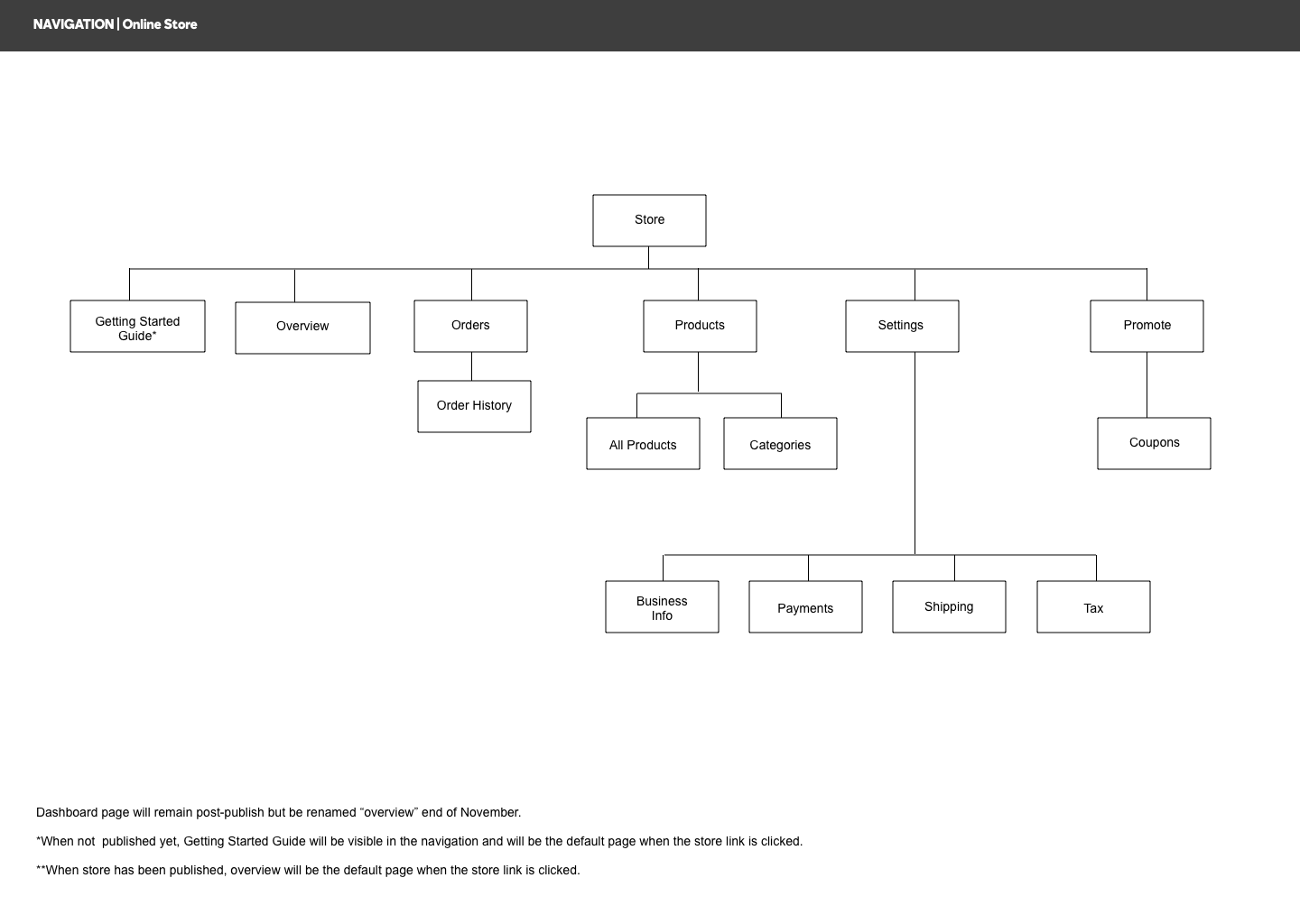
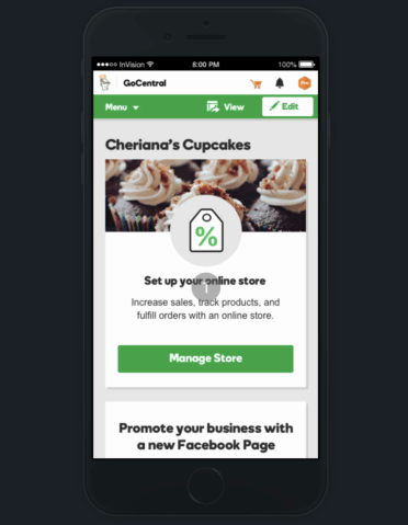
The first set of user testing showed this navigation for the Online Store plan

A look at the GoDaddy system in-app header styling which was not optimized for mobile devices
Up until this point I had been working within the styling constraints of the core GoDaddy system in-app header that was terrible on mobile and did not allow for multiple tiers of dropdown menus on desktop. It was time to think out of the box to alleviate hierarchy issues.

Sketch exploring secondary navigation

Secondary navigation idea on mobile

Idea for utilizing title bar area for secondary navigation

A more traditional approach to categorizing the menu items

Exploration into using a mega menu proved it to be unnecessary based on the amount of links in every plan except Online Store

List view menu with bottom actions
Accordion menu keeping the global nav at top exposed
Solution
Collaboration with the GoDaddy design system team ensured that the final design would scale and make sense for other Godaddy apps beside GoCentral. After countless hours of user testing and exhausting every possible solution, we've found a solution that meets both user needs and business goals.
Post-launch we found that discovery of the dashboard, email marketing, and SEO tools increased significantly and activation of those apps went from 13% to 56%.
The desktop design is still being developed but in the meantime you can see the final IA and mobile design live on GoDaddy's GoCentral.
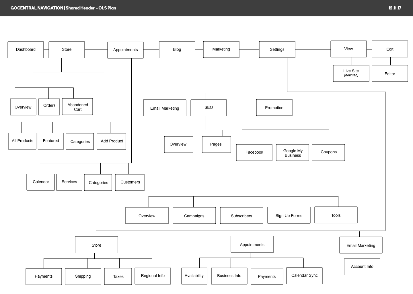
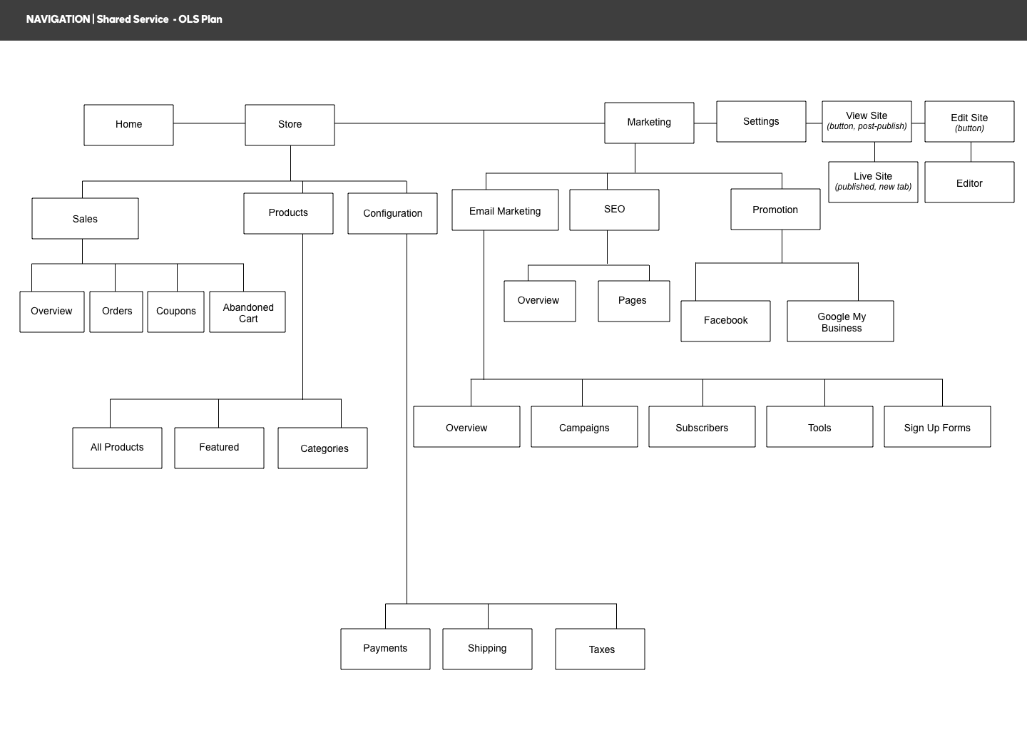
Final IA for Online Store plan

Final mobile nav design

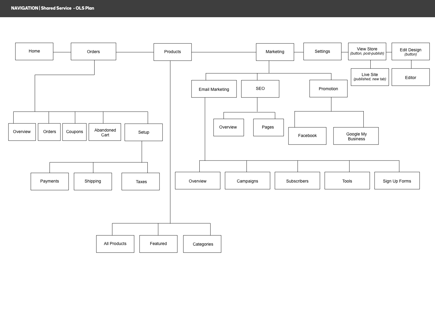
Final design for Online Store plan on desktop


